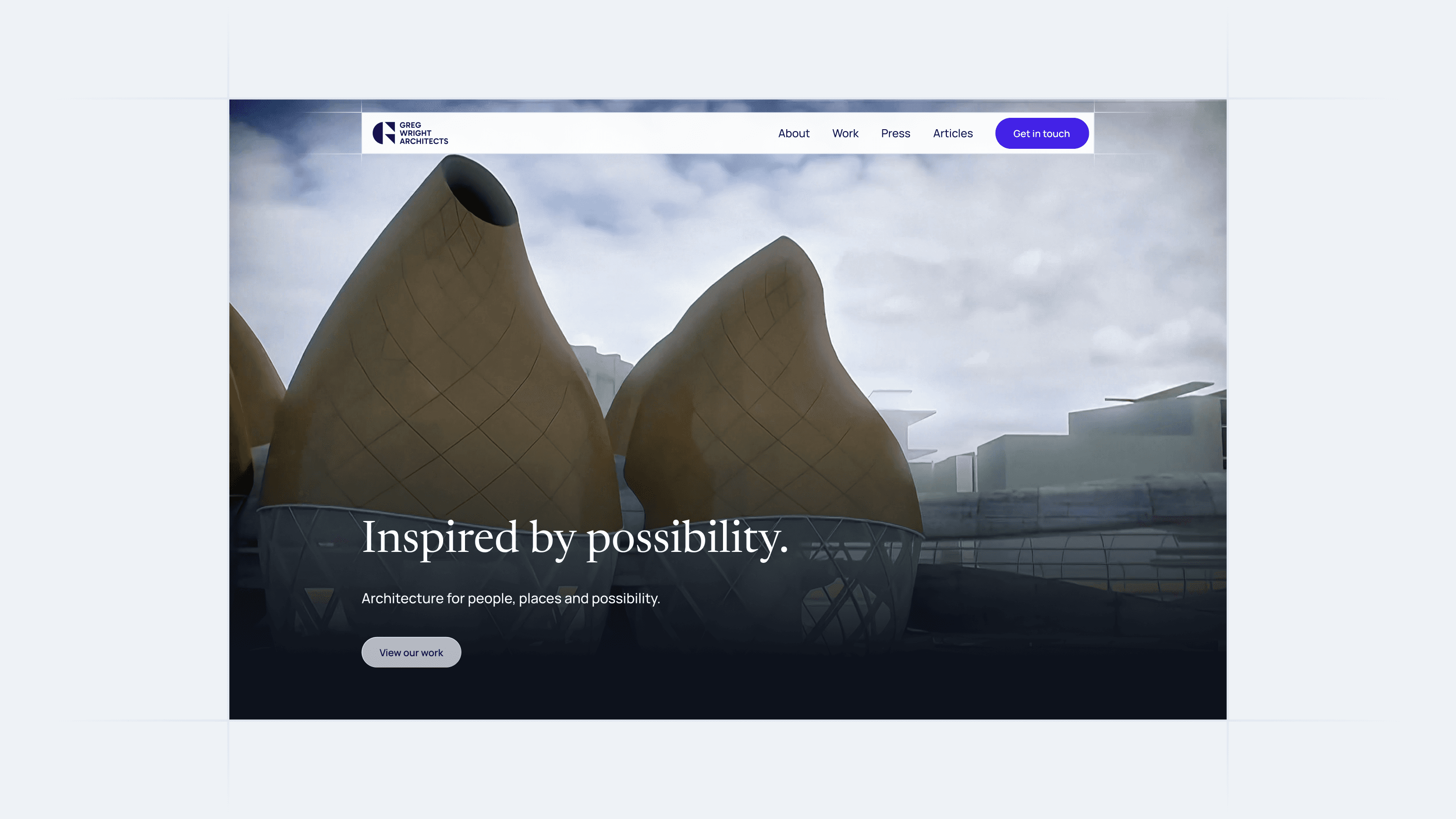
Giving 30 years of architectural legacy a more recognisable form
GWA is a Cape Town architecture studio with more than 30 years of work across residential, commercial and public spaces. While the practice had built a strong reputation through its work, its visual identity didn’t carry the same level of recognition or authorship. The opportunity was to create a brand that made GWA more identifiable without losing the equity it had already built.

The value was already in the name
Rather than reinventing a practice with three decades of history, we looked at where its existing equity lived. Greg wanted the brand to carry the same sense of authorship as the buildings themselves — a mark whose presence could add value, not simply identify the practice. While architecture studios often default to acronym-led identities, the most ownable element was already there: Greg Wright.

Turning authorship into a mark
We distilled the identity into a singular G, giving the practice a recognisable symbol directly connected to its founder. Constructed from simple geometric forms, the mark brings together two characteristics of Greg’s work. A curved form references the organic world that influences his architecture, while precise triangular elements reflect his constant pursuit of refinement. The result sits somewhere between an architectural symbol and an editorial monogram.